
A Game of Thrones quote frame works best when the idea still matters after the immediate recognition has passed. The catalogue contains designs connected with knowledge, identity, courage, power, mortality and political ambition. Those themes suit different people and rooms, even when the frames share a black A4 format.
This is not a list of famous dialogue. Reproducing a large collection of scripted lines would be less useful for choosing décor and could turn an editorial guide into copied entertainment content. Instead, the sections below describe the emotional idea, imagery and typography represented by actual products.
The pieces are fan-oriented artworks found in the Yaadscape catalogue. No official licence, endorsement or affiliation is claimed.
Choose the idea before the wording
Ask what the frame should contribute to the space. A knowledge theme can suit a reading corner or study. An identity theme may feel personal in a bedroom. Courage and mortality designs have sharper emotional weight, while power and political strategy fit a darker gaming room or media wall.
When the intended idea is clear, compare how the artwork communicates it. A minimal typographic frame feels direct; a sword or throne gives the text a visual anchor; a character silhouette makes the connection more specific. The same words can feel very different in red, monochrome, gold or icy treatments.
Browse the Movies, TV & Music collection to compare text-led frames with scenic and character art before deciding how much typography the room needs.
Knowledge and thoughtful identity
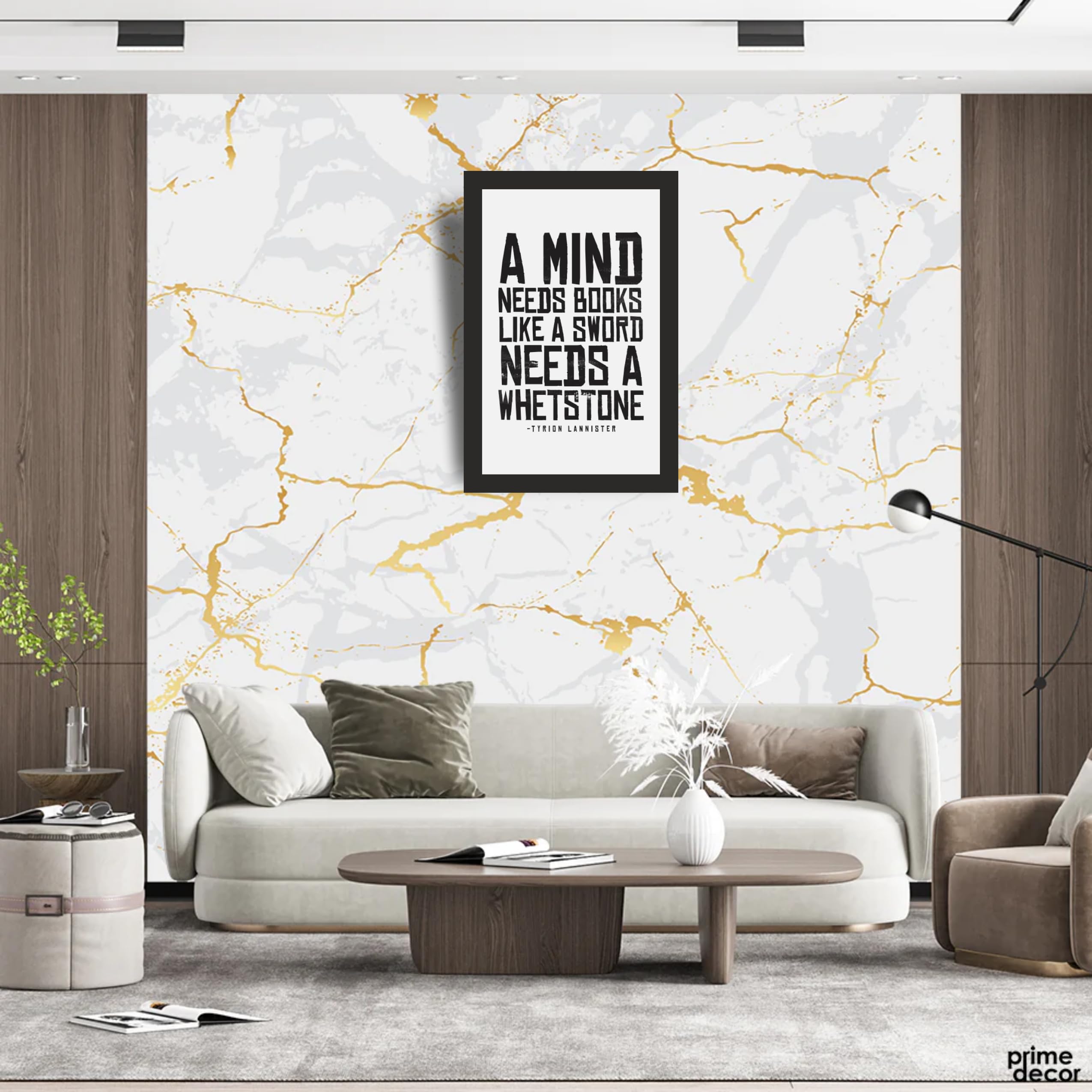
Tyrion-related designs in the catalogue frequently connect intellect, books and self-knowledge. These concepts make practical sense above a bookshelf, writing desk or reading chair because the subject supports the activity of the space. Line art and restrained goblet imagery can keep the frame from feeling like a slogan poster.
Identity-led artwork should be chosen carefully as a gift. A theme about accepting or understanding oneself may resonate with one person and feel overly personal to another. If you are unsure, select a broader symbol-led design or ask about their preferred character rather than guessing from a familiar line.
Keep nearby décor quiet enough for the typography to be read. A shelf of colourful book spines already supplies detail, so a monochrome or limited-palette frame often works best.
Courage, change and confronting fear
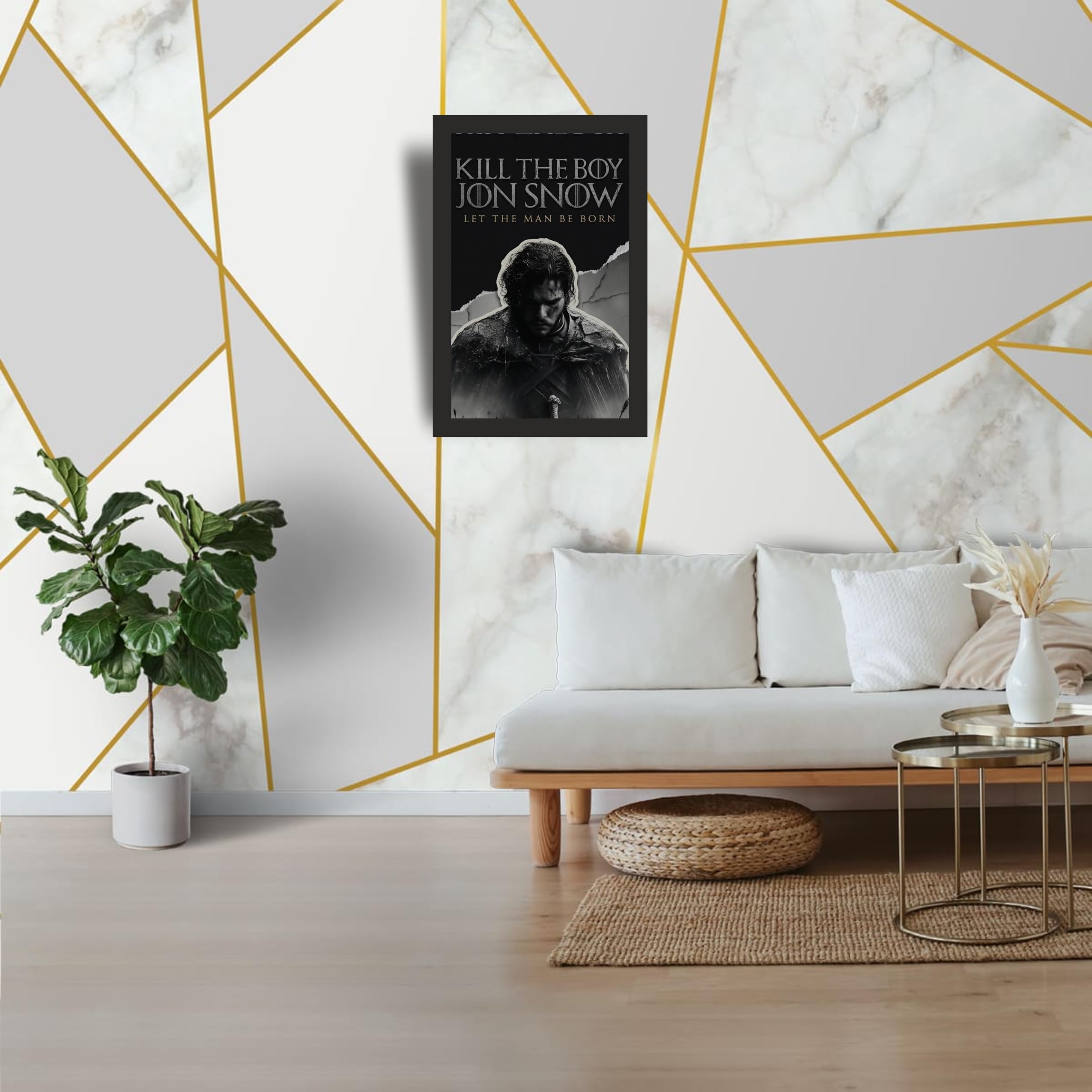
Jon Snow and sword-silhouette designs often carry ideas of growing into responsibility, acting despite fear or refusing to surrender to death. These are stronger themes than ordinary productivity slogans and may suit a fan who values the character context.
In a workspace, avoid treating fictional language as a guaranteed formula for success. The frame can be a reminder or conversation piece, not a promise that courage removes every obstacle. In a bedroom or gaming room, the sword imagery adds vertical structure and pairs naturally with darker furnishings.
One courage-led frame is usually sufficient. Several intense lines placed together can make a small wall feel confrontational rather than motivating.
Power, strategy and political ambiguity
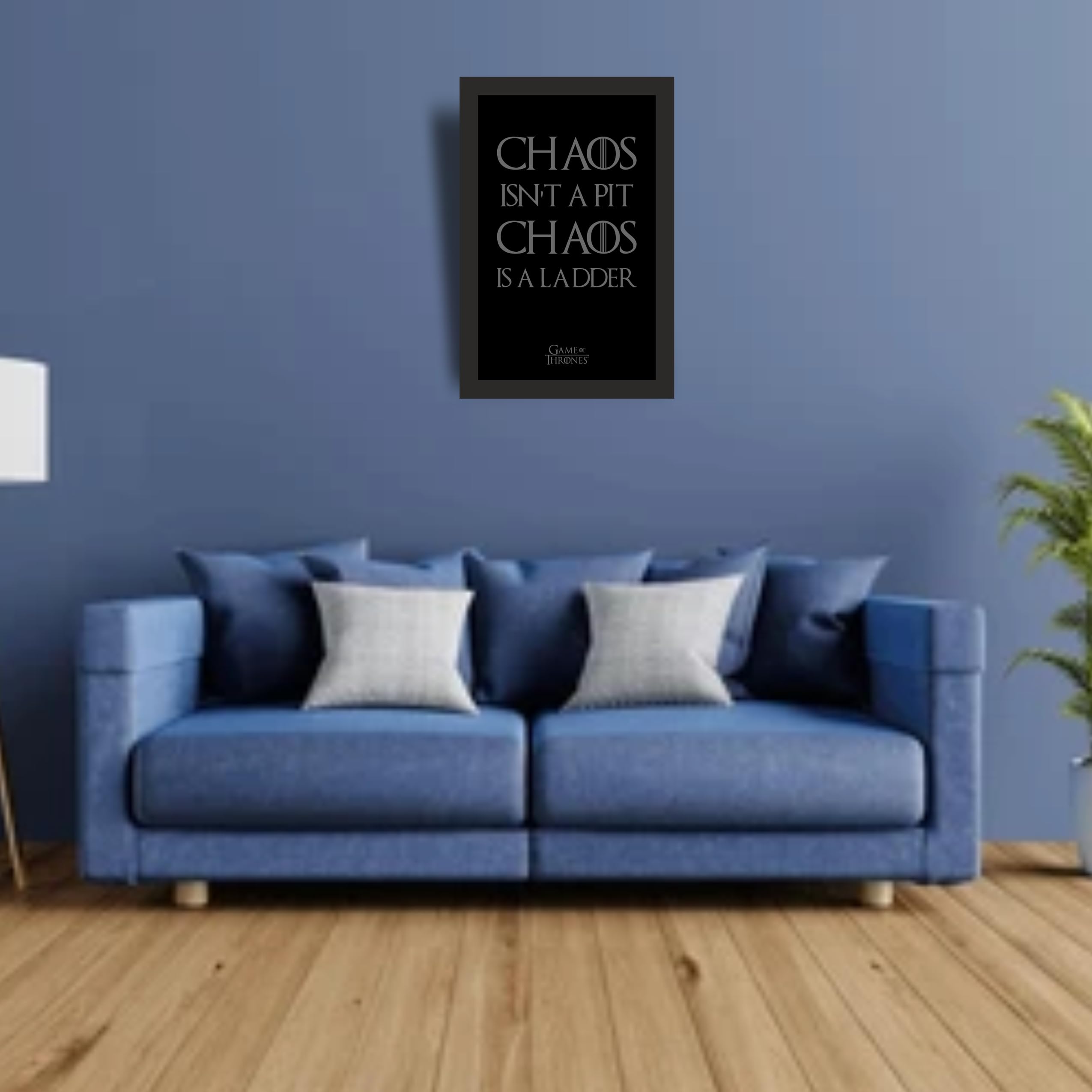
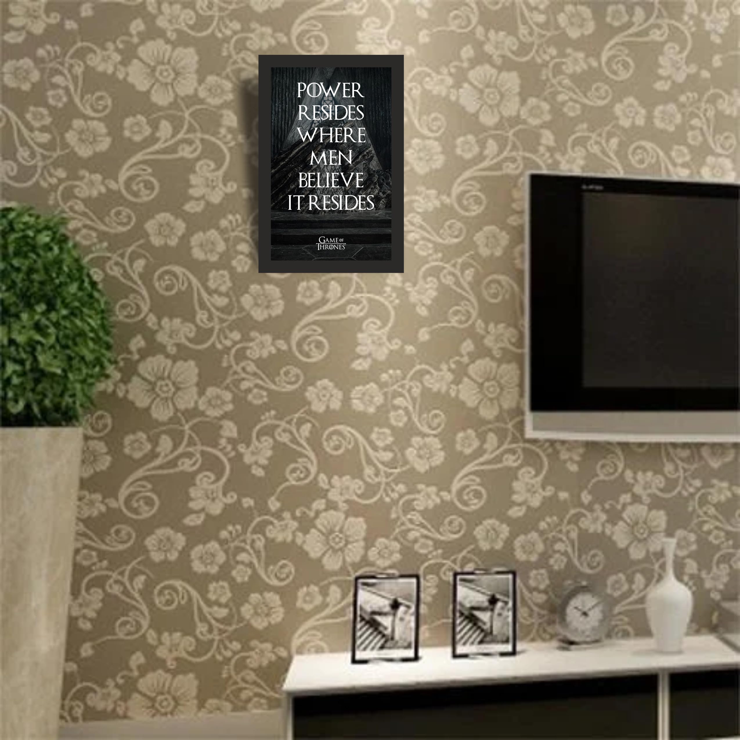
Chaos- and power-related pieces draw attention because their ideas are not simple encouragement. They point toward perception, influence and uncertainty. Minimal typography can emphasise the concept, while an Iron Throne image turns it into a clear political-fantasy composition.
These designs work best in entertainment spaces, libraries or private offices where the context is understood. For a shared workplace, consider whether the wording could be misread without the series reference. A throne-led visual may communicate fandom more safely than a large statement about power.
The Game of Thrones wall art guide explains how to balance a strong quote frame with landscape or symbol-led artwork.
Six quote designs with distinct visual roles
The selected products represent six different roles: minimal strategy, knowledge and books, character development, power with throne imagery, mortality with a sword, and a concise courage motif. The selection is editorial rather than a sales ranking. Visit the Yaadscape pages for complete product imagery, dimensions, price information and the external Amazon purchase button.
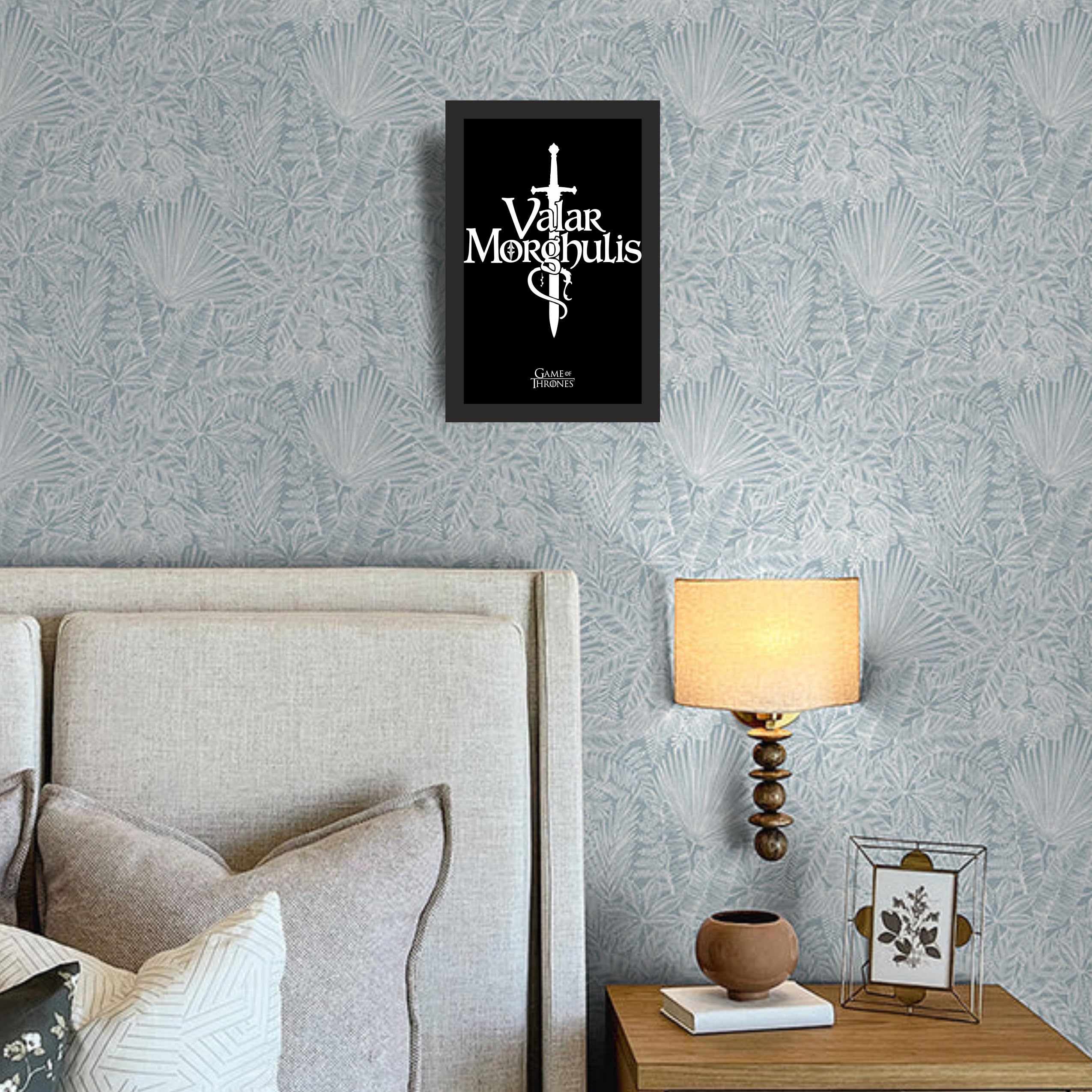

Typography, readability and placement
Read the design from the distance at which it will normally be viewed. Fine text that looks clear in a product close-up may be less effective across a room. High contrast and a short visual hierarchy are especially important above a desk or beside a television.
Avoid placing multiple quote frames with different typefaces in a tight grid. If you want a group, use one text-led piece as the anchor and support it with a house sigil, castle or landscape. The house-sigil guide offers suitable symbol-led counterparts.
Use paper templates for spacing, keep frames outside monitor glare, and leave enough blank wall around the text. In a gift situation, confirm that the recipient actually displays quote art; some fans prefer purely visual scenes.
Frequently asked questions
Which quote theme suits a study room?
Knowledge, books and thoughtful identity are the most natural fit. Choose restrained typography and a palette that does not distract from reading or work.
Can I give a quote frame without knowing a favourite character?
A broad power, courage or symbol design is safer than a character-specific piece. The fan gift guide provides other low-risk ideas.
How much dialogue should an article reproduce?
Only the minimum needed to identify an actual product. Useful editorial content should analyse the idea and visual treatment rather than copy substantial dialogue or publish a long quote list.
A closer editorial lens
A useful final test is to hide the product title and look only at the composition. Notice where the eye lands first, whether the text has a clear reading order and whether the supporting image adds meaning or merely fills space. If the design works only when viewed extremely close, it may be better for a reading corner than a wall across the room.
When giving quote art, leave room for the recipient to interpret it. Avoid explaining a complex fictional idea as a rule they should follow. A short note about why the design reminded you of their interests is warmer than turning the gift into advice about ambition, bravery or identity.
Choose a frame that still works as design
Recognition may attract attention first, but composition determines whether a quote frame belongs in the room. Select the theme for the person, the typography for the viewing distance and the imagery for the surrounding décor.
A frame that remains visually balanced even when nobody is reading it will age better than one chosen only for a familiar sentence. That is the standard to use when comparing the verified pieces above.